We've
all been there, a really great idea hits us for a layout. We can see it in our head - and boy is it
amazing. But, as we work on creating
that vision on the computer, certain aspects just don't seem to be coming
together. Recently, I saw just such a
layout in one of my Digitals' Challenges.
When I saw the thumbnail sized version before I opened it in the
gallery, I could see the amazing idea.
But, when I viewed it at gallery size, I instantly knew that it didn't
turn out how she had envisioned how it would.
Before
we go any further, thanks so much to Maureen (AKA Mayeyesup) for allowing me to
use her layout as the example for this tutorial. She really did have a great idea, one that
others might want to duplicate, but could use a little help in figuring out how
to create it. Also, thanks to Monica (AKA
Sparky_Mom) for assisting me in so many ways with the creation of this tutorial.
Good
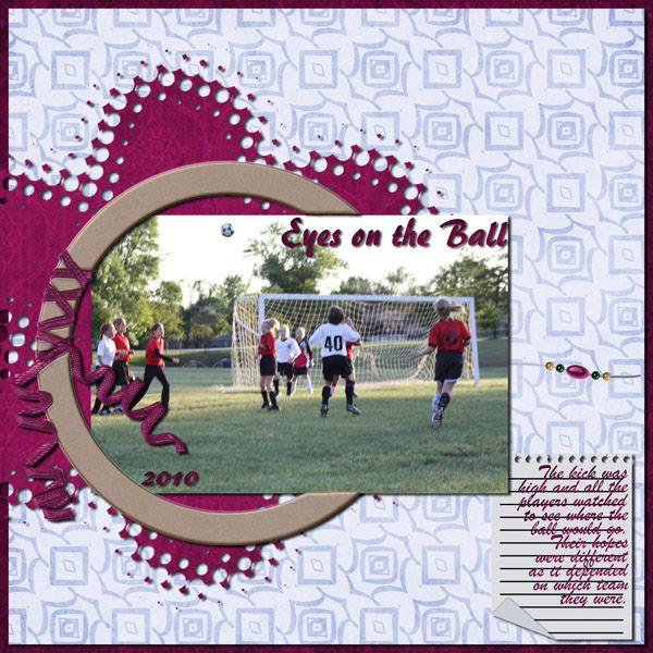
Maureen's
idea was to use the circular frame in a different way. She wanted to tuck a 4x6 photo into it where
part of the photo tucks behind the frame and the remainder goes over or in
front of the frame. She accented this
with a grungy photo mask (used with a paper), beads, and a notebook paper for
her journaling.
The
problems…. The main problem is that she had trouble getting the photo and frame
to have that "in front of and behind" appearance. When that caused problems, she took other steps
to try to show the depth of the layout; she beveled the frame and added shadows
that don't exactly look right. Beveling
that doesn't fit or shadows that are the wrong size will cause a good design to
fall flat.
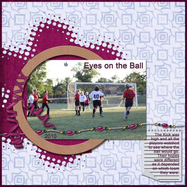
Monica and I worked together on the recreation layout - she used Photoshop, but everything she did can be repeated in PSE and probably any other software that allows for layering. Monica used a very simple font, not because Maureen's was wrong, but simply to use one that everyone can use. We decided to move the beads for two reasons: 1. the beads are a little lost on the original layout and 2. putting them where we did adds to the threaded look of the photo/frame aspect.
Better
Monica and I worked together on the recreation layout - she used Photoshop, but everything she did can be repeated in PSE and probably any other software that allows for layering. Monica used a very simple font, not because Maureen's was wrong, but simply to use one that everyone can use. We decided to move the beads for two reasons: 1. the beads are a little lost on the original layout and 2. putting them where we did adds to the threaded look of the photo/frame aspect.
Now,
the details….
Photo
mask. Monica didn't have the same mask,
so she used the original layout that Maureen provided (full sized) to re-create
it. In the "Better" example,
you can see that she missed a few spots and it isn't perfect. She used a smaller shadow than Maureen did to
show that this would be a flatter item on the layout. Remember, your shadows should be relative to
the size of the object. Flat papers or
items that would seem painted or printed onto a layout would have the smallest
shadows.
The
frame/photo. Whenever you want to have
something be "threaded" through something else, you'll need to have
portions of it to be duplicated. Once
you get all the parts positioned EXACTLY like you want, I suggest duplicating
all involved layers; you can rearrange the order of the layers as needed. This will also allow you to only make
"cuts" on the layer copies.
Before you do anything else, link the layers together. This way, if one gets moved, they all move! For now, let's work with only the frame and
photo - make both photo layers and one frame layer visible and turn all the
other layers invisible. Order the photos
so that the original is behind the frame and the copy is in front of it (you'll
see that the photo sits on top of the frame.
Add shadows to the original photo and frame layers only. Now, here's the magic, on the photo copy you
can cut away the left half of the photo; this will allow the frame layer and
all it's shadows to show! To get the
beads to also be threaded, I would suggest having the original beads be over
the photo copy and then have the frame copy on top of all of it. Shadow the beads (remember, they are thicker
and would have a larger shadow) and then cut away or erase all of the frame
EXCEPT what you want to be covering the beads.
Monica has the ribbon over the beads also, but you could chose to have
it behind. The choice is totally yours.
Finishing
details. The notebook paper was added
with text in the same place and text was added to the photo (making sure it was
layered over the photo copy!) The
biggest change here is that we did NOT put a shadow on the font. The only time you want to add a shadow to
lettering is when you want it to appear to be something with depth; such as
puffy letters, stickers, or some other item that is added to the layout. When you want a font to appear to be inked
onto the layout, as it would be on this photo, you shouldn't give it
shadows.
You'll
also notice that we didn't add a bevel to the frame. As a designer, I already added depth to the
frame. The edges of the original frame
are beveled and the ribbon was shadowed onto the frame. Adding a bevel to it altered the texture and
color of the frame and changed the way the ribbon worked with the frame.
Best
As
great as it looked at this point, there were still little problems that could
be fixed to make it even better!
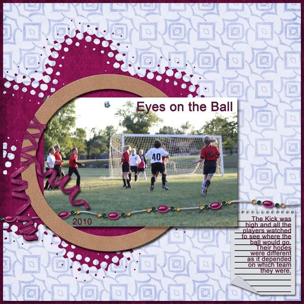
Photo
Mask. The small problems were corrected
and the shadow was made even a touch smaller.
Once other problems were corrected, those small issues showed more.
Frame/Photo. The final fix for any threaded look is to
look VERY closely at shadows and fix as needed.
The places where we had to digitally stack actually have missing
shadows; this is most visible where the photo goes over the frame. You can see on the "better" layout
that it just looks wrong - there isn't a shadow on the frame on the bottom
right side. To fix this, you can do a
couple things: 1. use a burn tool to create your own shadow on the frame layer
or 2. add a shadow to the photo copy. If
you do the first, then you are changing the frame in a way that you can't
adjust later, but it is the faster fix.
If you add a shadow to the photo copy, then you'll have a new problem to
fix; it will add shadows all the way around it!
To fix this, you'll need to "simplify" the photo copy (this
makes the shadow become part of the image instead of being an applied style),
next, you need to erase or cut out all the edges of the photo copy except for
the areas where you want this new shadow to show. Repeat for the beads as needed.
Journaling. This is such a small detail, but something
that I like to do whenever I can. All we
did here was make sure that the lettering fit on the lines of the journal
paper. To do this, just change the size of
the text! You can change it in just one
direction to get the perfect fit.
Taking it even farther!
We
stopped at the "best" step above. This is where we would probably
take it if we were doing this type of layout.
But, there is one move step you could do to get an even better finished
layout. While we did achieve a look that
convinces the eyes that the photo is threaded through the frame, it isn't
exactly perfect. Well, maybe it is too
perfect! The photo is still exactly
rectangular with straight edges.
"In real life", the photo would have a curve to it from where
it switches from being flat against the background and then curves over the
frame.
If
you wanted to make a layout using this technique and you wanted it to be a real
show-stopper, you could take this last step!
Go back to the original photo layer and make a new copy. Rename the copy to indicate it is your
"curved" photo. Hide the
original and the straight copy layers.
At this point, you can use whatever method you want to warp or alter the
photo. Then, duplicate the curved photo
and repeat the layering/shadowing fixes listed above.


No comments:
Post a Comment